Back-to-backs and goalie performance

I’ve been curious for a while about the impact of rest and travel on goaltending, especially after reading the work of Gus Katsaros and Eric Tulsky, so I re-ran the numbers on save percentages including back to back games, away versus home and with danger zones included. We know that shooting rates for go down and rates against go up, especially for high danger shots, when teams play back to back games; this is enough to make me wonder whether our enhanced database will tell us more with goaltending than we previously knew.

Eric Tulsky previously found that the back-to-back edge was worth a full percentage point in the second half of back to backs, from .912 to 901, using data from the 2011-12 and 2012-13 seasons. Since we now have data at war-on-ice.com with quality goaltending data from 2005-06 until this season (2014-15),  it’s worth a fresh look. Here’s the effective difference by season.

b2b

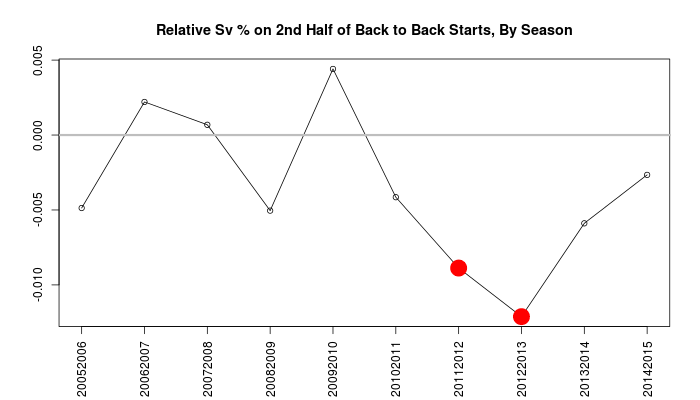
The reputation for tired goalies has apparently been made based on the two worst years in our record; in fact, in three other seasons the effective change in save percentage is positive.

Given the additional tools we have at our disposal, let’s break them out and see if they tell us anything new about this. Let’s do it in this sequence using good old logistic regression:

  1. Start with the home advantage, the indicator for the second half of a back to back, and the interaction between the two.
  2. Add in danger zones, since we know this has played a role.
  3. Add score difference, since teams with the lead have higher shooting percentages.
  4. Add in the game state (5v5, PP, SH, 4v4, etc)
  5. Finally, we add in terms for each goaltender in case there are selection effects for which coaches are willing to lean on their number ones.

The negative changes in save “percentage” in thousandths for each factor:

Model Away Goalie Back-To-Back (Home) Back-To-Back (Away)
1 3.3 1.3 3.1
2 1.2 2.1 3.4
3 0.6 1.9 3.4
4 0.1 1.8 2.9
5 -0.03 2.3 3.7

The home advantage on save percentage disappears the more factors we add, and the difference in “tired” performance persists, but only at 3 and a half points below their usual performance, not 11. I was personally expecting the differences to be bigger, and I was also expecting shot danger to play a bigger role than effectively none. Still, while we still don’t have a good idea if it’s there’s greater risk for injury, or other unknown factors, we can be confident that coaches aren’t completely nuts if they send their Number One out back to back.

Replication materials:

The Road To WAR, Part 11: Shot Rates For And Against, or that quality that we deliberately avoid calling “possession”

This is the big one that drives most of what we see in the game, but is also the most difficult to calculate directly: how would the shot rates for and against a team behave if we swapped out a player with their equivalent replacement?

First, here’s the progression in methods that we’ve seen so far:

  1. Good old plus-minus (+/-), which no one seems to think is good but everyone agrees is old. It was the number that was used for the longest time to capture supposed relative defensive ability, but among its flaws are that it’s too dependent on goaltenders, too dependent on linemates, and the sample sizes are too small to produce a strong signal. Relative plus-minus doesn’t have the first problem, if the only job is to compare against one’s own teammates, but can still suffer with too much common time with other players.
  2. Corsi/Fenwick/Bowman1 numbers take away the impact of the goaltender and of shooting skill, in favor of at least a tenfold increase in sample size. They add in contributions from usage like zone starts which can now be detected statistically and still have the linemate and competition problem.
  3. Regression-adjusted statistics for shot differential; see our comprehensive historical list here, then add in Stephen Burtch’s dCorsi and Domenic Galamini’s Usage-Adjusted Corsi. Essentially, make adjustments to the macro-level stats depending on whom they played with and against.

You could hypothetically drop in any of the above pieces and spin them into a measure of goals; the conversion than can be slotted along the other contributions to get a total value. But we have a few other needs:

  1. We want to adjust for teammates and competition simultaneously, including replacement level players.
  2. We need to separate offensive and defensive contributions.
  3. We adjust for usage, including whether a faceoff was won or lost, and score situation.
  4. We model separately for each shot danger, because we know that forwards and defensemen contribute differently between and within these groups.
  5. We also want to distinguish between performance (what happened) and talent (what would be most likely in future).

Continue reading

The Road to WAR Series (Index)

All the articles in the Road to WAR series.

  1. The Single Number Dream
  2. All Rate Now
  3. Shot Quality Assurance, plus A Bonus on Travel Fatigue
  4. You can’t spell “An Incremental Improvement” without two “team”s<
  5. Getting Goals Above Baseline
  6. Rate-Based Event Adjustments For Score Effects, Home Advantage and Event Count Bias
  7. What do we mean by “replacement”? A case study with faceoffs
  8. Penalties Taken And Drawn
  9. Historical Shooting and Goaltending
  10. Modern Goaltending and Shooting
  11. Shot Rates For And Against

The Road to WAR, Part 10: Modern Goaltending and Shooting

Preamble: here’s where we start to integrate the pieces of WAR together a bit more. If you want to sneak ahead and look at the results, you can look here for the app being updated regularly.

This is where things get a little more interesting for us. We have a lot more information on the last 12 NHL seasons when it comes to the circumstances of every shot on goal, particularly after Lockout II from 2004-2005. We know the players on the ice, the approximate location of the shot and the shot type, loads of detail that can help us identlfy skill not only for both goaltenders and shooters, but also for the other players on the ice.

This volume of data can, of course, also lead us into trouble if we’re not careful. So bearing in mind that we’re trying to estimate both the talent and performance of players for scoring and preventing goals, we’re going to break this into a few smaller pieces:

  1. The process of generating shot attempts, at each level of danger, given the skaters for both teams (and not their goaltenders), is temporal and measured in rates. This will be done for skaters in the next post but uses the same approach as in Goals Above Baseline for teams.
  2. The success of each shot taken, given first the skaters and goaltenders, and if possible, the playmakers and defenders.2

The most important point we’re making here is that we’re conditioning on the fact that a shot was taken. We’re not measuring here the likelihood that a replacement player on an other average team would be in a position to get that shot — that happens in the shot generation piece of our approach.

We’re going to build this in stages to make sure everything is as we expect, and figure out where any surprises might happen before answering the bigger questions.

Continue reading

A brief pause, in which we discuss the different kinds of questions we should be asking, and the difference between talent and performance

One of the biggest questions when it comes to WAR is exactly what question we’re trying to answer by constructing these measures. There are a few that we need to address, because they’re often all asked at once.

  1. What actually happened?
  2. What would have happened, given what we know now, and events repeated over again?
  3. What would have happened (if we had made a change)?
  4. What’s going to happen next?
  5. What will happen next, if we can make a change?

For each of these points, the answer seems clear. The biggest issue is that they often overlap, and figuring out exactly what questions we’re answering is a bit more difficult. When it comes to what we’re trying to learn about players,

What actually happened? 

This is the most clear-cut to express. The numbers themselves are not adjusted for anything; players with abnomally high shooting percentages get to keep the goals they scored, and defensemen who allow a large number of shots are still victimized by their iess competent linemates in the final totals. And ultimately, this is how we measure performance.

The problem is, these measures are meaningless without context. In the strictest sense, it’s impossible to compare two player performances because we can’t known exactly how player A would have performed in the events in which player B was involved.

This is why…

What would have happened (if we had made a change)?

is the midpoint that lets us answer those questions, since the change in question is “what if we swapped out our player in question and replayed the game over?”

This is the simplest adjustment: a baseline for context. What would be expected to happen to a stand-in player in similar circumstances? “Average” levels are a reasonable start, but we endorse the idea of “replacement” because that’s our best guess of who would have to take that job next if something came up.

So for the purposes of WAR, we’re not making adjustments to the actual observed events, only to what we expect would have happened. And its primary purpose is not to forecast future performance. This is the current approach we’re using for our WAR measures, partly because it’s the least difficult to understand, but we’re not limited to it.

Best widespread sports example: MVP voting (eventually).

This connects to…

What would have happened, given what we know now, and events repeated over again?

This is what we’re getting at when we try to measure talent; if the situation repeated itself, with the same conditions3, what kind of an outcome would we be most likely to see.

This can involve quite a bit of adjustment, mostly to get rid of noise in small samples but also to gain strength from the system as a whole. Results that are inconsistent with others are treated with suspicion and examined carefully.

Best widespread sports example: Barstool arguments over who was better, Gretzky or Lemieux, if they happened between Sam and Andrew.

What’s going to happen next?

This is pure prediction — gambling if you’re losing, arbitrage if you’re winning. We don’t get to fiddle any knobs, change any rosters or have any kind of pretend control over the future. Our only task is to guess what’s to come and with what certainty.

The distinct thing about this is that the proof of the pudding is in the eating: it doesn’t really matter to people how you cooked up your estimates, because credibility is earned by being right more often in the long run.4

Best widespread and legal sports example: Fantasy leagues.

What will happen next, if we can make a change?

Ideally this is a question that connects back through the previous threads: screening out noise, estimating talent levels, forecasting forward and projecting to future outcomes — given that we have decisions to make and courses to change.

By and large this is separate from the immediate question of estimating WAR for past seasons, particularly if it’s a question of performance measurement and not talent. But it is connected in that it would be worth knowing what skills are worth what amount in salary and development.

Best example: The actual business of sports.

GUEST POST: Hockey And Euclid — Calculating Statistical Similarity Between Players

Editor’s note:  This is a guest post written by Emmanuel Perry.  Manny recently created a Shiny app for calculating statistical similarities between NHL players using data from www.war-on-ice.com.5  The app can be found here.  You can reach out to Manny on Twitter, @MannyElk.

We encourage others interested in the analysis of hockey data to follow Manny’s lead and create interesting apps for www.war-on-ice.com.

The wheels of this project were set in motion when I began toying around with a number of methods for visualizing hockey players’ stats.  One idea that made the cut involved plotting all regular skaters since the 2005-2006 season and separating forwards and defensemen by two measures (typically Rel CF% and P/60 at 5v5).  I could then show the position of a particular skater on the graph, and more interestingly, generate a list of the skaters closest to that position.  These would be the player’s closest statistical comparables according to the two dimensions chosen.  Here’s an example of what that looked like:

mh_s (1)

(click to enlarge)

The method I used to identify the points closest to a given player’s position was simply to take the shortest distances as calculated by the Pythagorean theorem.  This method worked fine for two variables, but the real fun begins when you expand to four or more.

In order to generalize the player similarity calculation for n-dimensional space, we need to work in the Euclidean realm.  Euclidean space is an abstraction of the physical space we’re familiar with, and is defined by a set of rules.  Abiding by these rules can allow us to derive a function for “distance,” which is analogous to the one used above.  In simple terms, we’re calculating the distance between two points in imaginary space, where the n dimensions are given by the measures by which we’ve chosen to compare players.  With help from @xtos__ and @IneffectiveMath, I came up with the following distance function:

distance

And Similarity calculation:

similarity

In decimal form, Similarity is the distance between the two points in Euclidean n-space divided by the maximum allowable distance for that function, subtracted from one.  The expression in the denominator of the Similarity formula is derived from assuming the distance between both points is equal to the difference between the maximum and minimum recorded values for each measure used.  The nature of the Similarity equation means that a 98% similarity between players indicates the “distance” between them is 2% of what the maximum allowable distance is.

To understand how large the maximum distance is, imagine two hypothetical player-seasons.6  The highest recorded values since 2005 for each measure used belong to the first player-season; the lowest recorded values all belong to the second.  The distance between these two players is the maximum allowable distance.

Stylistic similarities between players are not directly taken into account,7 but can be implicit in the players’ statistics.  Contextual factors such as strength of team/teammates and other usage indicators can be included in the similarity calculation, but are given zero weight in the default calculation.  In addition, the role played by luck is ignored.8

The Statistical Similarity Calculator uses this calculation to return a list of the closest comparables to a given player-season, given some weights assigned to a set of statistical measures.  It should be noted that the app will never return a player-season belonging to the chosen player, except of course the top row for comparison’s sake.

app-comparables

(click to enlarge)

Under “Summary,” you will find a second table displaying the chosen player’s stats, the average stats for the n closest comparables, and the difference between them.

app-summary

(click to enlarge)

This tool can be used to compare the deployment and usage between players who achieved similar production, or the difference between a player’s possession stats and those of others who played in similar situations.  You may also find use in evaluating the average salary earned by players who statistically resemble another.  I’ll continue to look for new ways to use this tool, and I hope you will as well.

** Many thanks to Andrew, Sam, and Alexandra of WAR On Ice for their help, their data, and their willingness to host the app on their site. **

The Road to WAR, Part 9: Historical Shooting and Goaltending

Thanks to Benjamin Wendorf of (among other places) hockey-graphs, we have a collection of historical shot data for skaters from 1967-2013, and for goaltenders from 1952-1982. We can use this to explore the basics of replacement shooting and goaltending under the barest of definitions — the success rate for forwards, defensemen and goaltenders based on shooting and save percentage. What we take from here, we’ll use in the next round with our full database using our refined shot data.

First, we use the Poor Man’s Replacement to mark all shooters with less than 30 shots in a season, and goaltenders facing fewer than 300 shots, as the players whose joint results are our gauge for replacement-value talent.9 We then run these through a binomial model where results are shrunken toward a common mean in each year; the more shots each player has, the closer the result is to the observed shooting percentage. The original estimates of replacement value are a little noisy from year-to-year, so we use a loess smoother to establish an “expected” replacement value over time.

Our estimates over time for replacement shooting are below:

replacement-shooting

There is a clear elevation in overall and replacement shooting percentage for forwards through the 1980s; there is a more modest but similar bump for defensemen.

The same pattern is detectable in replacement-level goaltending; the difference is in the effective range of save percentages, which is far smaller than the range for shooters.

replacement-goaltending

Now that we have replacement-level shooting and goaltending, the correction for each player is straightforward — how many goals would a replacement player score/allow on the same number of shots.

We have a reduced table of outcomes posted here for seasonal and total results. Highlights include Lemieux-Gretzky-Gretzky finishing 1-2-3 for goals above replacement in shooting success, though the most impressive result to me is Steven Stamkos finishing at number 8, one of the few high-achieving performances in the Bettman era. Since the goals to wins ratio was higher in that time, converting to pure WAR would yield an even more impressive result.

So why not stick with this method right away? This might be adequate in the long run — and we’ll be checking it with our data as we go — but there are a few opportunities to upgrade on it.

  • We know what goaltenders saved what shots; checking the quality of competition is natural.
  • We have moderately reliable location data and drop-ins for rebounds and rush shots. All of these factors are known to increase the likelihood of a goal.
  • We have game situations and score; even accounting for the danger of the shot, there’s still a change in goal likelihood that we should build in.
  • Finally, we ought to test whether or not we can detect playmaker effects or the defensive efforts of the opposing skaters. If these effects are substantial, they should be detectable over long periods of time or in particular subsets of the data.

Links: Top and bottom outcomes by season and overall for skaters and goaltenders.

The Road To WAR, Part 8: Penalties Taken And Drawn

Note: This is a quick detour from the original plan, but it illustrates one of the most apparent difficulties that we’re facing in this task: the changing nature of data over time. Plus, it’s quicker than the others.

How valuable is a penalty drawn or taken to a team? In goals, the marginal effect is clear: you get up to 2 minutes during which your scoring rate for goes up and the rate against goes down. And if it’s your best penalty killers who are penalized, they don’t get to help clean up the mess they’ve made in the process.

The secondary effects are less clear. For example, what changes in terms of a team’s future effort when a player takes an ill-advised penalty? We’re not in a position to answer this when it comes to the share of responsibility to the penalty taker; we can only assess a team’s performance during those times.

And so, for the time being we’re left with the credit and blame for the penalty taker and drawer in terms of an expected goals measure. To get goals above replacement, we need to know the rate at which a replacement player at each position would take or draw penalties — aside from misconducts and matching fighting majors — so we do this in the same type of method as with faceoffs and the Poor Man’s Replacement method:

  1. Pick a threshold below which we consider a player to be replacement level. For this demo we consider this to be three full games, or 180 minutes of ice time.
  2. Establish placeholders for forwards and defensemen alike.
  3. Fit a model to establish the most likely rate at which each player (including the replacements) takes and draws penalties. We use a Poisson model for the rate with regression toward the mean for the group.

The results for the 10 seasons since 2005 are below. Note that we do not have penalties drawn in the 2005-06 and 2006-07 seasons.

pen-drawn-taken

The “replacement” rate for taking penalties for forwards and defensemen is higher than the league average. When it comes to penalties drawn, forwards draw penalties at a greater rate than defensemen, which is to be expected on scoring plays; replacement rate at each position is roughly the same as the league average otherwise. This suggests that if drawing penalties is a skill, it’s exceptionally rare, whereas general discipline to avoid taking penalties is clearly a behaviour seen in full-time players.10

Now it’s simple enough to get the number of penalties drawn and taken by replacement players at each position, and subtract this from their actual results. The final table is available in full here.

We convert to goals with an approximation: A team on the powerplay scores at a clip of roughly 6.5 goals/60 and allows 0.78 shorthanded goals/60. We move each of those rates from a 5v5 rate of 2.5 goals per 60 minutes, and assume that 20 percent of powerplays end in goals, for an average of 1.8 minutes on the PP, and reach an average figure of 0.17 net goals per penalty taken or drawn. For now we use the relation that 6 goals equals one win.

The champion in total penalty WAR in total volume in the last 10 seasons is Dustin Brown, and it’s not even close:  8.47 wins above replacement for Brown in that time. Per 60 minutes, though, he’s the third ranked player in the top 50 over that time; Nazem Kadri and Darren Helm take the 1 and 2 spots.

The special prize here goes to Patrick Kaleta of the Buffalo Sabres, who has a penalties drawn rate well above the average and in the number one spot for the top 200. We know this about him already but it helps his case that he has a penalties-taken rate that isn’t as bad as a replacement player and gives him an extra boost.

Links:

The Road to WAR, Part 7: What do we mean by “replacement”? A case study with faceoffs

It’s been a busy time here at war-on-ice.com, and we haven’t had as much time to do anything with regard to our stated primary mission — the creation of an all-inclusive Wins Above Replacement measure.11 So it’s about time we went back to our roots and provided a coherent framework on which we can move forward.

In the next week we’ll be releasing our proposed three main elements from which we can derive WAR using the data we have, in what we feel is the ascending order of importance: faceoffs, shooting/goaltending success, and shot attempt rates.12

For each process, the pathway we’re laying out to establish value sounds straightforward:

  1. Measure the relative value of a particular skill or event in the game.
  2. Establish what a replacement player would have done in this place according to a standard rule.
  3. Convert this value to goals.
  4. Convert goals to wins, which is a measure that can change from season to season.

We’ve been talking about parts 1, 3 and 4 in previous entries in this series, and we will continue to do so in the parts to come. But we need to establish what “replacement” means, because there are two important qualities we need to factor in.

First, there’s the standard definition: a level of performance against which we judge everyone else, under the assumption that it’s the level of skill that a team could purchase at the league minimum price. This is fairly clear-cut in most examples in, say, baseball: for every position, there’s a different baseline expected level of performance, and the average can be calculated at each position by that standard; replacement level can then be calculated relative to the average. A shortstop that hits 20 home runs in a season is more valuable than a first baseman with the same numbers, because “replacement-level” shortstops will tend to have less power.

But a benchmark for performance isn’t sufficient here. When we measure team achievement, we simultaneously adjust for the strengths of their opponents to get a more precise estimate. To do the same thing for player-player interactions, we have to adjust for player strengths, but since estimates for replacement players are inherently unstable — there’s so little data on each player, almost by definition — it helps us even more to have a single standard for each type of replacement player to ensure that our adjustments are accurate.

Continue reading

Sam’s Zone Transition Time Paper

In November, I introduced a preliminary version of my work on “Zone Transition Times” (ZTTs) at the Pittsburgh Hockey Analytics Workshop.  The slides for and video of my presentation can be found here.

In December, I submitted a paper on ZTTs to the Sloan Sports Analytics Conference; the paper was not selected as a finalist in the research paper competition.  A slightly modified version of this paper can be found here.  The results and text are unchanged from the December submission, except for minor typos.

Since then, I’ve identified some flaws with this work that I didn’t (have time to) explore in November/December:

Continue reading