Category Archives: Analytics

GUEST POST: Hockey and Euclid — Introduction to Bombay Ratings

Note:  This is part two of a series of guest posts written by @MannyElk.  In the first installment of Hockey and Euclid, Manny outlined the player similarity calculation used in the Similarity Calculator. The explanations to follow will assume knowledge from that article, so we urge anybody who wishes to understand the derivation of the Bombay function in detail to get caught up.  

We at www.war-on-ice.com are happy to host Manny’s newest Bombay Ratings App!  We continue to encourage others in the hockey research community to follow Manny’s lead and develop public applications that will further the frontiers of research in hockey analytics.

While working on the Similarity Calculator, I stumbled upon a study in which Euclidean distance was used to compare NBA players to Michael Jordan.  The author used the distances to generate a list of the most similar players to the man most would agree is the best ever.  From this idea, Bombay ratings were just a conceptual hop, skip and jump away.  Instead of choosing my own Michael Jordan from a list of historical players, I invented one.

Continue reading

Back-to-backs and goalie performance

I’ve been curious for a while about the impact of rest and travel on goaltending, especially after reading the work of Gus Katsaros and Eric Tulsky, so I re-ran the numbers on save percentages including back to back games, away versus home and with danger zones included. We know that shooting rates for go down and rates against go up, especially for high danger shots, when teams play back to back games; this is enough to make me wonder whether our enhanced database will tell us more with goaltending than we previously knew.

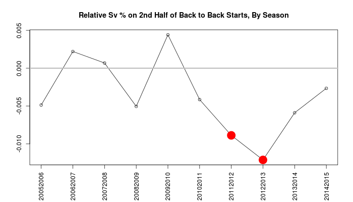
Eric Tulsky previously found that the back-to-back edge was worth a full percentage point in the second half of back to backs, from .912 to 901, using data from the 2011-12 and 2012-13 seasons. Since we now have data at war-on-ice.com with quality goaltending data from 2005-06 until this season (2014-15),  it’s worth a fresh look. Here’s the effective difference by season.

b2b

The reputation for tired goalies has apparently been made based on the two worst years in our record; in fact, in three other seasons the effective change in save percentage is positive.

Given the additional tools we have at our disposal, let’s break them out and see if they tell us anything new about this. Let’s do it in this sequence using good old logistic regression:

  1. Start with the home advantage, the indicator for the second half of a back to back, and the interaction between the two.
  2. Add in danger zones, since we know this has played a role.
  3. Add score difference, since teams with the lead have higher shooting percentages.
  4. Add in the game state (5v5, PP, SH, 4v4, etc)
  5. Finally, we add in terms for each goaltender in case there are selection effects for which coaches are willing to lean on their number ones.

The negative changes in save “percentage” in thousandths for each factor:

Model Away Goalie Back-To-Back (Home) Back-To-Back (Away)
1 3.3 1.3 3.1
2 1.2 2.1 3.4
3 0.6 1.9 3.4
4 0.1 1.8 2.9
5 -0.03 2.3 3.7

The home advantage on save percentage disappears the more factors we add, and the difference in “tired” performance persists, but only at 3 and a half points below their usual performance, not 11. I was personally expecting the differences to be bigger, and I was also expecting shot danger to play a bigger role than effectively none. Still, while we still don’t have a good idea if it’s there’s greater risk for injury, or other unknown factors, we can be confident that coaches aren’t completely nuts if they send their Number One out back to back.

Replication materials:

GUEST POST: Hockey And Euclid — Calculating Statistical Similarity Between Players

Editor’s note:  This is a guest post written by Emmanuel Perry.  Manny recently created a Shiny app for calculating statistical similarities between NHL players using data from www.war-on-ice.com.  The app can be found here.  You can reach out to Manny on Twitter, @MannyElk.

We encourage others interested in the analysis of hockey data to follow Manny’s lead and create interesting apps for www.war-on-ice.com.

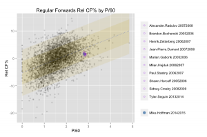
The wheels of this project were set in motion when I began toying around with a number of methods for visualizing hockey players’ stats.  One idea that made the cut involved plotting all regular skaters since the 2005-2006 season and separating forwards and defensemen by two measures (typically Rel CF% and P/60 at 5v5).  I could then show the position of a particular skater on the graph, and more interestingly, generate a list of the skaters closest to that position.  These would be the player’s closest statistical comparables according to the two dimensions chosen.  Here’s an example of what that looked like:
mh_s (1)

(click to enlarge)

The method I used to identify the points closest to a given player’s position was simply to take the shortest distances as calculated by the Pythagorean theorem.  This method worked fine for two variables, but the real fun begins when you expand to four or more.

In order to generalize the player similarity calculation for n-dimensional space, we need to work in the Euclidean realm.  Euclidean space is an abstraction of the physical space we’re familiar with, and is defined by a set of rules.  Abiding by these rules can allow us to derive a function for “distance,” which is analogous to the one used above.  In simple terms, we’re calculating the distance between two points in imaginary space, where the n dimensions are given by the measures by which we’ve chosen to compare players.  With help from @xtos__ and @IneffectiveMath, I came up with the following distance function:

distance

And Similarity calculation:

similarity

In decimal form, Similarity is the distance between the two points in Euclidean n-space divided by the maximum allowable distance for that function, subtracted from one.  The expression in the denominator of the Similarity formula is derived from assuming the distance between both points is equal to the difference between the maximum and minimum recorded values for each measure used.  The nature of the Similarity equation means that a 98% similarity between players indicates the “distance” between them is 2% of what the maximum allowable distance is.

To understand how large the maximum distance is, imagine two hypothetical player-seasons.  The highest recorded values since 2005 for each measure used belong to the first player-season; the lowest recorded values all belong to the second.  The distance between these two players is the maximum allowable distance.

Stylistic similarities between players are not directly taken into account, but can be implicit in the players’ statistics.  Contextual factors such as strength of team/teammates and other usage indicators can be included in the similarity calculation, but are given zero weight in the default calculation.  In addition, the role played by luck is ignored.

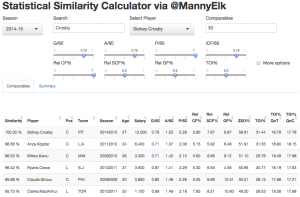
The Statistical Similarity Calculator uses this calculation to return a list of the closest comparables to a given player-season, given some weights assigned to a set of statistical measures.  It should be noted that the app will never return a player-season belonging to the chosen player, except of course the top row for comparison’s sake.
app-comparables

(click to enlarge)

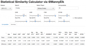
Under “Summary,” you will find a second table displaying the chosen player’s stats, the average stats for the n closest comparables, and the difference between them.
app-summary

(click to enlarge)

This tool can be used to compare the deployment and usage between players who achieved similar production, or the difference between a player’s possession stats and those of others who played in similar situations.  You may also find use in evaluating the average salary earned by players who statistically resemble another.  I’ll continue to look for new ways to use this tool, and I hope you will as well.

** Many thanks to Andrew, Sam, and Alexandra of WAR On Ice for their help, their data, and their willingness to host the app on their site. **
The Road To WAR, Part 8: Penalties Taken And Drawn

Note: This is a quick detour from the original plan, but it illustrates one of the most apparent difficulties that we’re facing in this task: the changing nature of data over time. Plus, it’s quicker than the others.

How valuable is a penalty drawn or taken to a team? In goals, the marginal effect is clear: you get up to 2 minutes during which your scoring rate for goes up and the rate against goes down. And if it’s your best penalty killers who are penalized, they don’t get to help clean up the mess they’ve made in the process.

The secondary effects are less clear. For example, what changes in terms of a team’s future effort when a player takes an ill-advised penalty? We’re not in a position to answer this when it comes to the share of responsibility to the penalty taker; we can only assess a team’s performance during those times.

And so, for the time being we’re left with the credit and blame for the penalty taker and drawer in terms of an expected goals measure. To get goals above replacement, we need to know the rate at which a replacement player at each position would take or draw penalties — aside from misconducts and matching fighting majors — so we do this in the same type of method as with faceoffs and the Poor Man’s Replacement method:

  1. Pick a threshold below which we consider a player to be replacement level. For this demo we consider this to be three full games, or 180 minutes of ice time.
  2. Establish placeholders for forwards and defensemen alike.
  3. Fit a model to establish the most likely rate at which each player (including the replacements) takes and draws penalties. We use a Poisson model for the rate with regression toward the mean for the group.

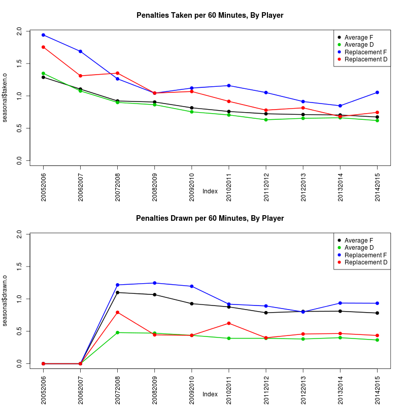
The results for the 10 seasons since 2005 are below. Note that we do not have penalties drawn in the 2005-06 and 2006-07 seasons.

pen-drawn-taken

The “replacement” rate for taking penalties for forwards and defensemen is higher than the league average. When it comes to penalties drawn, forwards draw penalties at a greater rate than defensemen, which is to be expected on scoring plays; replacement rate at each position is roughly the same as the league average otherwise. This suggests that if drawing penalties is a skill, it’s exceptionally rare, whereas general discipline to avoid taking penalties is clearly a behaviour seen in full-time players.

Now it’s simple enough to get the number of penalties drawn and taken by replacement players at each position, and subtract this from their actual results. The final table is available in full here.

We convert to goals with an approximation: A team on the powerplay scores at a clip of roughly 6.5 goals/60 and allows 0.78 shorthanded goals/60. We move each of those rates from a 5v5 rate of 2.5 goals per 60 minutes, and assume that 20 percent of powerplays end in goals, for an average of 1.8 minutes on the PP, and reach an average figure of 0.17 net goals per penalty taken or drawn. For now we use the relation that 6 goals equals one win.

The champion in total penalty WAR in total volume in the last 10 seasons is Dustin Brown, and it’s not even close:  8.47 wins above replacement for Brown in that time. Per 60 minutes, though, he’s the third ranked player in the top 50 over that time; Nazem Kadri and Darren Helm take the 1 and 2 spots.

The special prize here goes to Patrick Kaleta of the Buffalo Sabres, who has a penalties drawn rate well above the average and in the number one spot for the top 200. We know this about him already but it helps his case that he has a penalties-taken rate that isn’t as bad as a replacement player and gives him an extra boost.

Links:

The Road to WAR, Part 7: What do we mean by “replacement”? A case study with faceoffs

It’s been a busy time here at war-on-ice.com, and we haven’t had as much time to do anything with regard to our stated primary mission — the creation of an all-inclusive Wins Above Replacement measure. So it’s about time we went back to our roots and provided a coherent framework on which we can move forward.

In the next week we’ll be releasing our proposed three main elements from which we can derive WAR using the data we have, in what we feel is the ascending order of importance: faceoffs, shooting/goaltending success, and shot attempt rates.

For each process, the pathway we’re laying out to establish value sounds straightforward:

  1. Measure the relative value of a particular skill or event in the game.
  2. Establish what a replacement player would have done in this place according to a standard rule.
  3. Convert this value to goals.
  4. Convert goals to wins, which is a measure that can change from season to season.

We’ve been talking about parts 1, 3 and 4 in previous entries in this series, and we will continue to do so in the parts to come. But we need to establish what “replacement” means, because there are two important qualities we need to factor in.

First, there’s the standard definition: a level of performance against which we judge everyone else, under the assumption that it’s the level of skill that a team could purchase at the league minimum price. This is fairly clear-cut in most examples in, say, baseball: for every position, there’s a different baseline expected level of performance, and the average can be calculated at each position by that standard; replacement level can then be calculated relative to the average. A shortstop that hits 20 home runs in a season is more valuable than a first baseman with the same numbers, because “replacement-level” shortstops will tend to have less power.

But a benchmark for performance isn’t sufficient here. When we measure team achievement, we simultaneously adjust for the strengths of their opponents to get a more precise estimate. To do the same thing for player-player interactions, we have to adjust for player strengths, but since estimates for replacement players are inherently unstable — there’s so little data on each player, almost by definition — it helps us even more to have a single standard for each type of replacement player to ensure that our adjustments are accurate.

Continue reading

Sam’s Zone Transition Time Paper

In November, I introduced a preliminary version of my work on “Zone Transition Times” (ZTTs) at the Pittsburgh Hockey Analytics Workshop.  The slides for and video of my presentation can be found here.

In December, I submitted a paper on ZTTs to the Sloan Sports Analytics Conference; the paper was not selected as a finalist in the research paper competition.  A slightly modified version of this paper can be found here.  The results and text are unchanged from the December submission, except for minor typos.

Since then, I’ve identified some flaws with this work that I didn’t (have time to) explore in November/December:

Continue reading

Predictability Differences for Forwards and Defensemen

Note:  If you haven’t yet read our post on how SCF% better predicts future GF% than does CF%, we recommend reading that first.  The definitions of metrics, data used, and methodology used in this post is the same as what is written here, so we refer interested readers to there for more info.

Summary:  This is an update to our previous post on the best metrics for predicting player performance.  Here, we split the analysis out by position (forwards vs. defensemen).

In this analysis, using all data going back to the 2005-06 NHL season:

  1. For forwards, SCF% is the best predictor of future GF% of the metrics we tested
  2. For forwards, CF% is a better predictor of future GF% than is FF%, but for defensemen, the opposite is true.
  3. For defensemen, FF% is the best predictor of future GF% (with SCF% finishing a close second) of the metrics we tested.
  4. SCF% is a much better predictor of future GF% for forwards than it is for defensemen.
  5. In general, future GF% is more accurately predicted for forwards than it is for defensemen.

Continue reading

NEW: Annual salary/compensation data for skaters

When CapGeek founder Matthew Wuest announced on Saturday that he was shutting the site down for personal health reasons, we were doubly saddened, for the well-being of an important member of the community but also for the loss of a stellar resource used by many. I was particularly in awe at the reach of the data he found — it’s one thing to work with public sources, but the dedication to finding what he had, or working to build a position where it comes to you, is outstanding. We also deeply respect his privacy as he goes through this tough time and we hope that he’ll be able to resume doing the things he loves (whether or not CapGeek was one of them.)

Needless to say, we won’t be replicating his massive efforts any time soon.

What we do have is access to public data on annual compensation, from past USA Today records and current NHLPA postings, dating across our database from 2002 to the present. After cleaning and matching, we’ve added it to the Goaltender HistorySkater History and Skater Comparison apps when individual season data is present. (Goaltender Comparisons will be added soon.)

This has total compensation in salary and bonuses by year; it is not adjusted for inflation or cap share. We see it as a stopgap first and a starting point second to have deeper discussions about what users want that we can provide.

Better Than Corsi: Scoring Chances More Accurately Predict Future Goals For Players

Summary:

Since the 2005-06 NHL season, the percentage of Scoring Chances For (SCF%) is a better predictor of future Goals For (GF%) than Corsi For (CF%) is for individual players.  (Under specific conditions, of course, but it’s promising either way.)

Combining data across all seasons since 2005-06, the season-to-season correlations are:

  1. cor(Past SCF%, Future GF%) = 0.322
  2. cor(Past CF%, Future GF%) = 0.311
  3. cor(Past GF%, Future GF%) = 0.287

Using multiple linear regression and combining across all seasons, we find that:

  • For every one-percentage-point increase in SCF%, future GF% is expected to rise by about 0.41 percentage points, holding all other variables constant.
  • For every one-percentage-point increase in CF%, future GF% is expected to rise by about 0.22 percentage points, holding all other variables constant.

Continue reading

The Road To WAR, Part 6: Rate-Based Event Adjustments For Score Effects, Home Advantage and Event Count Bias

Summary: We get back on the Road to WAR and address the adjustments for circumstances that others have used. We blend them back into our preferred rate-based method.

In the Road to WAR series (which I’m delighted to return to) we’ve been using event rates as a basis for how we model hockey. One of its strongest points is that it works at multiple scales; from a single event in a game to multiple seasons, we can quickly calculate both expected values and variances once we know how the rates should be altered, up or down, so that our comparisons take sample size into account.

The strongest reason I prefer to use the rates approach? Not only is it a reasonable model for how the game goes, it lets us add different combinations of effects, observations and quirks simultaneously while judging their impact, separately or cumulatively. And we’ve got a few of them that are getting people’s attention that are basically together:

  • Home ice (dis?)advantage — systematic differences between home and away performance. (Older than dirt, so no references provided.)
  • Score effects — in game, team behaviour changes based on whether the team is leading or trailing, and proposed corrections tended to take one of two forms: the approach credited to Eric Tulsky reweights a simple average according to precalculated baseline rates, and the approach from Micah Blake McCurdy reweighs the events themselves based on said underlying rates. (In brief, teams that are trailing tend to shoot more and their quality of shot is worse; those in the lead shoot less but better.)
  • Rink count bias — the official scorers in each building can be externally inconsistent with each other on what constitutes a shot attempt on goal. (The counts get worse with hits and turnovers, but I’m not considering them in this piece.) A recent piece by Michael Schuckers and Brian Macdonald models the inconsistencies by rink using a linear model form and Elastic Net shrinkage, to identify which rinks have count rates that are statistically different from the league mean.

Continue reading